What is the long-run relation between economic activity and the stock market? From Main Street to Wall Street analyzes, inter alia, this question. Here, I present some of the conclusions.
As mentioned in my previous post (link), From Main Street to Wall Street describes how economic activity influences financial markets, in particular stock markets. It distinguishes between the long-run and the shorter-run relation. The “long run” refers to decades, even centuries. The short run refers to months, potentially a few years.
This post presents some of the book’s conclusions with respect to the historical long-run relation between the economy and the stock market. This is both an intriguing and fascinating topic, and the conclusions are not always as one would have guessed a priori.
The relation between stock returns and economic activity
The intuition of many people is that stock returns are high when economy growth is high. This is a good starting point. I emphasize in my book, though, that things are not always as simple as that. The long-run relation between economic activity and stock markets illustrates this.
A key observation is that, in the long run, stock returns and economic growth do not go hand in hand, generally. This is counterintuitive for many people, and thus important to emphasize. People have this tendency to believe that when the economy is doing well, firms prosper, which should lead to high stock returns, right? I emphasize and demonstrate that – in the long run – the story is more subtle.
There are several ways to illustrate this.
In those parts of the book that deal with the long run, I typically examine data spanning the past 100 to 150 years. Let’s start with a simple illustration. The average growth rate of what is still the world’s largest economy, the US economy, has been two percent per annum over the past 150 years (average annual growth rate of US real per capita GNP). Has the average annual real return from the US stock market over the same period also been 2%? No(!), for sure not. The average annual real US stock return has been close to 7% over the same period.
A five percentage-point difference (7% – 2%) might not seem like a lot, but compounded over 150 years it is enormous. To illustrate, imagine you (or one of your great-grand parents) invested one US dollar in the US stock market in 1871. Imagine also that you, since then, have reinvested all dividends. I.e., you invested one USD in the stock market many years ago, held on to the investment, and reinvested all dividends. The cumulative value of this investment strategy would have turned into app. USD 15,000 after 150 years. This is even in real terms, i.e. after taking account of inflation. The long-run performance of the US stock market has been truly amazing. USD 1 has turned into USD 15,000.
What about the performance of the economy? If we normalize economic activity to USD 1 in 1871, i.e. similar to our investment of USD 1 in 1871, then the cumulative value of US economic activity (real capita GNP) is USD 17 after app. 150 years. Yes, I write 17, not 17,000 or something the like. This is a thousandth of the cumulative value of the stock market. The eventual cumulative value of an investment in the stock market seems disconnected from the eventual cumulative value of real economic activity. In the long run, there is an enormous difference between something that grows by 2% per annum and something that grows by almost 7% per annum.
Figure 1 illustrates how the value of an investment in the US stock market has developed over the last 150 years and contrasts it with the development in economic activity, normalized to USD 1 in 1871.

Source: From Main Street to Wall Street
In such a graph – where the cumulative value of the stock-market investment dominates so clearly – it almost seems as if there has been no growth in the US economy over the past 150 years. This is not true. Over such a long period, two percent annual growth in economic activity is in fact amazing. A country that grows by two percent per annum over 150 years ends up being one of the richest countries in the world. So, two percent growth in economic activity is a lot when sustained over such a long period. It just pales in comparison with almost 7% growth in the value of a stock market investment.
Another way to illustrate the lack of a simple relation between long-run economic growth and stock returns is to compare the experience of difference countries. Intuitively, one might expect that a country that has grown a lot historically is also a country that has had high stock returns. Again, the data do not back up this intuition.
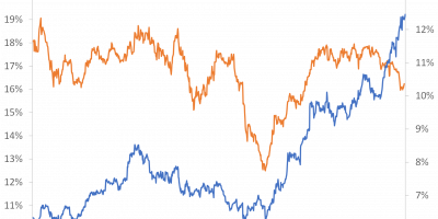
Figure 2 shows average annual real stock returns and growth rates of real GDP per capita for a number of countries since 1900. The countries are ranked according to the size of average returns.

Source: From Main Street to Wall Street
The US stock market has delivered the highest average annual return, at close to 7%. Has the US economy also been growing the fastest? No. During the past century, the fastest growing economy has been the Japanese. But the Japanese stock market has delivered only half of the return the US stock market has delivered. Similarly, the French economy has been doing fine, but its average annual real stock return has been mediocre. And so on. There is only little evidence that fast growing economies have also delivered higher stock returns.
Thinking deeper about this, it might not be that surprising after all. Stock returns are the sum of a risk-free return and a risk premium. The risk-free rate is in most economic models tied to the growth rate of economic activity. Hence, when we add a risk premium, developments in economic activity and stock returns depart. The question thus becomes what determines the risk premium. I discuss this in the book.
When making comparisons such as those presented here, it becomes relevant whether one uses arithmetic or geometric averages. The volatility of economic growth and stock returns should be discussed too. One can also look at other periods, other measures of economic activity, and so on. I deal with all this in the book.
The relation between stock prices and economic activity
Does the stylized fact that average long-run growth rates of economic activity and average long-run stock returns differ imply that stock markets are living a life of their own, i.e. without any connection to underlying economic activity? The answer to this question is also “no”.
Stock returns are given by stock price gains and dividend yields. It turns out that growth in stock prices (not returns) in the long run is related to long-run growth in economic activity. Many economic models and an abundance of empirical evidence find that stock prices, dividends (not dividend yields), and economic activity share common long-run growth trends. With a fancy word, we say that stock prices and dividends/economic activity are cointegrated. Cointegration means that two variables that grow over time are driven by the same underlying stochastic growth trend, implying that a linear combination of the two series (for instance the difference between the two) does not grow over time. Lots of empirical work has demonstrated that stock prices and dividends are cointegrated, starting with the by-now famous articles by Campbell & Shiller in the late 1980s (link). I have also done extensive research demonstrating cointegration between stock prices and dividends/economic (link).
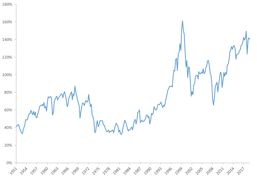
In my book, I do not conduct statistical tests of cointegration and so on. It is not that kind of book. But I explain what it means and I illustrate it. To provide just one illustration here, Figure 3 shows the development in the ratio of US real stock prices (S&P 500) to US real per capita GDP over the past 150 years, normalized to one in 1871.

Source: From Main Street to Wall Street
The conclusion from Figure 3 is that there is a tendency that the level of US stock prices and the level of US economic activity follow each other in the long run. The ratio of the two is normalized to “1” in 1871. It keeps being attracted to “1” throughout 150 years. There are fluctuations around the mean (“1”), but always a tendency to revert to the mean. The economic interpretation is that there have been (long) periods when the S&P 500 grew faster than economy activity (such as during the pre-WWI period, during the 1950s and 1960s, and during the past four decades), but such periods are followed by (long) periods when the economy grows faster than the stock market, such that the ratio of the two series reverts to its long-run mean. Over 150 years, stock prices follow underlying economic activity.
In the book, I discuss the international evidence, the relation between economic activity and dividends/earnings, and many other interesting topics. The bottom line is that stock returns are not related to the growth rate of economic activity in a simple linear fashion in the long run, as we otherwise might have thought, but stock prices relate to the level of underlying economic activity.
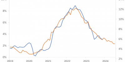
The last four decades
The final topic I would like to discuss briefly today is the fact that the valuation of stocks has soared, according to a number of metrics, during the past four decades.
Figure 3, for instance, shows that the S&P 500 currently trades at a historically high level relative to US GDP. If one relates stock prices to earnings or dividends, today’s stock-market valuation seems even more extreme. I show this in the book. Stocks seem “expensive”.
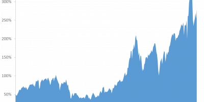
The final graph today, Figure 4, shows the total value of the US stock market in relation to total US GDP.
Source: From Main Street to Wall Street
In popular writing, this is also called the “Buffet Indicator” (link). People use different measures of the value of the stock market when calculating this measure. I use the total value of US corporate equity. As is clear from Figure 4, during the past four decades, growth in the value of US corporate equity has outpaced growth in the US economy. Warren Buffet uses this to argue that future stock returns will be low, as stocks have now become “expensive” in relation to the value of economic activity. Other people (link) use it to argue that the rewards to economic growth have been reallocated from workers to equity owners (helping to explain developments in inequality). In my book, I discuss some of the reasons we have seen an increase in valuations, such as the growing use of share buybacks, low interest rates, and other contributing factors. I also discuss whether it indicates low returns going forward, something that we will also return to on this blog.
Conclusion
This post has discussed some of the topics that I deal with in the initial parts of From Main Street to Wall Street. Those initial parts examine the long-run relation between economic activity and the stock market. I can, though, only provide a few glimpses here. The book discusses many additional topics in relation to long-run growth and returns, such as what is actually economic activity, are people “happier” when economic growth is high, growth and inequality, stock return decompositions, measures of risk, risk aversion, the equity risk premium, and so on and so forth. You have to read the book if you want to know more about these exiting topics.
In my next blog post, I will turn to a few of the book’s conclusions regarding the relation between economic activity and financial markets over the business cycle.