
Recent developments in headline inflation resemble those of the early 1970s. Core inflation, on the other hand, has been harder to tame, mainly because shelter inflation is high. But perhaps it is not so important how core inflation, shelter inflation and other subcomponents of inflation behave, as John Cochrane argues in a recent analysis. Probably more worrying for the inflation outlook is that the labour market remains strong, which is a difference from the 1970s. In the 1970s, the Phillips curve was in action: unemployment rose and inflation fell. Today, inflation has fallen steadily over the past year, but unemployment has not moved.
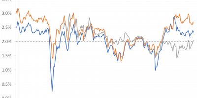
In January, I noted the remarkable similarity between inflation trends in the 1970s and today (link). During both episodes, the rise in inflation in the US lasted two years, then inflation peaked and the descent began. When I wrote the analysis in January, inflation in the US had already been falling for six months (inflation peaked in June 2022). There was doubt that inflation would continue on the same path as in the 1970s, i.e. that inflation would continue to fall. It did (see Figure 1). In the figure I have highlighted the development since January with a thick black line. The similarities between the inflation development in the 1970s and today are still striking.

Source: FRED of St. Louis Fed and J. Rangvid.
I also noted that core inflation and headline inflation behaved similarly in the 1970s. As headline inflation declined, so did core inflation. From its peak of almost 12% in early 1975, core inflation declined by 5 percentage points over the next year. Today, things are different. While headline inflation has declined steadily over the past year, the performance of core inflation has been less convincing (see Figure 2). From its peak of 6.5% in September 2022, core inflation has declined by only 2 percentage points.

Source: FRED of St. Louis Fed and J. Rangvid.
People are worried that core inflation is still too high and will be difficult to bring down. As I pointed out in my previous analysis (link), the main culprit is shelter inflation. In the 1970s, shelter inflation peaked when headline inflation peaked, and shelter, core and headline inflation followed similar paths on their way down. Today, shelter inflation is even more persistent, as Figure 3 shows, making core inflation more persistent.

Source: FRED of St. Louis Fed and J. Rangvid.
John Cochrane’s thoughts on core inflation vs. shelter vs. headline inflation: a sequel
How concerned should we be that core inflation is still too high? John Cochrane, in this great post (link), questions whether the differences between core, shelter, and headline inflation matter all that much. Headline inflation is what really matters to consumers, and headline inflation – at three percent – is now close to Fed’s two per cent target.
John showed regression results demonstrating that core inflation is not a better predictor of future headline inflation than lagged headline inflation itself. He argued that focusing on core inflation as a better measure of underlying inflationary pressures and hence future inflation is misplaced.
John notes that a regression of headline inflation on core inflation lagged by one year gives an R2 of 47% for the period 1960-2023 (47% of the movements in headline inflation explained by lagged core inflation), while the R2 is even higher, 55%, when regressed on lagged headline inflation. Core inflation is not a better indicator of future headline inflation. He concludes: “This is way worse than I thought.”
John, being a reasonable person, also refers to a post (link) that argues that core inflation is indeed a better indicator of future headline inflation post-1983, but there are no regressions in that post. Therefore, I add results from such regressions here.
Using lagged core inflation as a predictor of future headline inflation for the period 1983-2023 yields an R2 of 13%. Using lagged headline inflation, the R2 is 10%. Yes, core inflation provides a slightly better prediction of future headline inflation over the period 1983-2023, but the R2 is very low.
For the sake of completeness, I have also done this for euro area inflation since 1999 (introduction of the euro). Predicting headline inflation with lagged core inflation yields an R2 of 10%. Predicting headline inflation with lagged headline inflation gives an R2 of 20%. Perhaps the focus on core inflation in Europe is exaggerated.
(For the nerds: I am well aware that R2s can be inflated in this type of regression with overlapping observations and the regressor being a lagged persistent variable (link), but this is a blog post and not a peer-reviewed academic article, so that’s what you get. Besides, the results are so clear that the main conclusions would hold even if all the statistical refinements were made, I am pretty sure).
What are the general conclusions from these regressions? If one looks at the seven-decade period after 1960, then both lagged core inflation and headline inflation contain a reasonable amount of information about future headline inflation, but core inflation is not a better predictor than lagged headline inflation itself. On the other hand, if we look at the period after 1980, both headline and core inflation rates are not good predictors of future headline inflation, with lagged headline inflation performing somewhat worse. Overall, it is not clear why we should focus so much on core inflation if the reason is to look for a better measure of future headline inflation.
Inflation waves
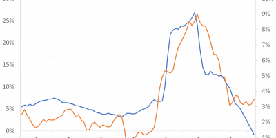
Now, despite headline inflation of three per cent, there is doubt that underlying inflationary pressures have been contained. I doubt it too. The fear is that inflation could return, as it did in previous inflationary periods, such as the 1940s and 1970s (see Figure 4).

Source: FRED of St. Louis Fed and J. Rangvid.
There were two waves of inflation in the US in the 1940s and 1970s. After being pushed back in the early 1940s and early 1970s, inflation began to rise again after 1.5-2 years. It would be nice if we could avoid such a second wave of inflation this time. What is somewhat worrying in this context is that the pressure on the labour market is very high, not least compared to the 1970s.
Phillips curves in the 1970s and today
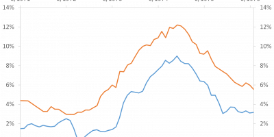
In contrast to the 1970s, the labour market has been surprisingly robust during this inflationary surge. Figure 5 shows how unemployment and inflation developed during the period when inflation fell in the early 1970s, and Figure 6 shows it for the current episode.

Source: FRED of St. Louis Fed and J. Rangvid.
During early 1970s, unemployment responded. The recession resulting from the inflationary surge lasted from November 1973 to March 1975. Unemployment rose from 5% in 1973 to 9% in 1975, and inflation came down subsequently. This is the Phillips curve in action: an inverse relationship between unemployment and inflation. Rising unemployment = > falling inflation.
This time this is not the case, as Figure 6 shows. Inflation has declined since June 2022, but the unemployment rate has not changed. This time there is no Phillips curve.

Source: FRED of St. Louis Fed and J. Rangvid.
Wages
The strong labour market today, i.e. low unemployment, means that wages have kept pace with inflation better than in the 1970s, as Figure 7 shows.

Source: FRED of St. Louis Fed and J. Rangvid.
Wages have been rising since 2017. At the beginning of 2022, wage growth was over 7%. By comparison, inflation reached 9% at its peak (June 2022). Since then, wage growth has declined somewhat, but is still around 5%.
In the early 1970s, wages rose by 8% in 1975, but inflation reached more than 12%. This, of course, meant that real wages collapsed in the 1970s. In 1974 real wages fell by more than 4% and in the late 1980s by 7-8%. This time real wages fell by 2% when it was at its worst, as Figure 8 shows.

Source: FRED of St. Louis Fed and J. Rangvid.
For workers, this is good news, at least in the short term. For policymakers, it is not, because it makes it harder to tame inflation permanently. The Fed fears that wages will continue to rise because of the strong labour market. And if wages continue to rise “too fast”, companies will also raise their prices too quickly, leading to inflation.
Conclusion
The trend in headline inflation today and in the 1970s is strikingly similar, while core inflation is proving more stubborn today.
In a recent post (link), John Cochrane argues that there is too much focus on core inflation. Core inflation is not a better predictor of future headline inflation than headline inflation itself. I expand on John’s regressions and offer additional perspectives.
Instead, the concern today is that the labour market is surprisingly strong. In the 1970s, unemployment rose while inflation fell. A perfect example of the Phillips curve in action. Today, inflation has been falling for more than a year and unemployment has not changed. Another sign that the Phillips curve has broken down? The Fed is concerned that the labour market is “too strong”. It is worried that inflation cannot be contained until the labour market is less tight and wage growth has cooled. In any case, the strong labour market is one reason why the economy has performed so surprisingly well during the past year’s inflation and interest rate hikes, which I will explore in more detail in my next analysis.