The behavior of the stock market during this recession has been perplexingly. To understand it, we need to answer three main questions: (i) why did stock markets fall so spectacularly during February/March, (ii) why did stocks rebound so spectacularly during April/May, and (iii) why is the stock market currently at its pre-crisis level? This blog post explains why these stylized facts are so difficult to understand jointly. In my next blog post (link), I will offer my interpretation of the evens.
Observing the stock market during this recession has been a like watching a roller coaster. The fall in late-February/early-March was the fastest bear market in history, the rebound has been historically fast, too, and – in spite of the worst recession ever – the stock market is currently back at pre-recession levels. Somebody leaving for the moon in January and returning now would not be able to see any trace in the stock market of the worst recession ever. This is in stark contrast to normal recessions. People interested in financial markets and the economy should be puzzled.
The problem – in a nutshell – is that if you claim that you understand why stocks are currently at pre-recession levels, then you face a challenge explaining why we needed to go through the fastest bear market ever during February/March. On the other hand, if you claim that the fast fall and rise in markets was just a short-lived technical blip (perhaps due to funding squeezes and fear), then you face a challenge explaining why that technical blip should result in a loss to the tune of USD 20 trillion (link). Finally, if you claim that you understand why markets fell so fast in February/March (perhaps because we were facing the worst recession ever – which, by the way, is a good explanation), then you face a challenge explaining why markets recovered so strongly in April/May/June, as the recovery cannot be explained by a brighter economic outlook. In fact, we have seen continuous downgrades of the economic outlook. E.g., the IMF WEO in June lowered its April forecasts for global economic output to –4.9%, from –3.0%. A huge downgrade. Strange that stocks recover in spite of this.
In this post, I describe the facts. I also review a couple of suggested, but wrong, explanations. In my next post (that I will publish next week), I will offer my view on what has been going on.
The facts
Here is an updated version of a graph that I have presented earlier. It shows the Danish, US, emerging market, and world stock markets (MSCI), normalized to one on January 1, 2020:

Data source: Thomson Reuter Datastream via Eikon.
Stock markets reached a temporary peak on February 19, after which they tanked dramatically. As mentioned here (link), it was the fastest US bear market in history.
The rebound has been equally spectacular. The US stock market is already back at its January 1 level. World and emerging markets are still a few percentages behind, but, basically, they have also recovered from the crisis.
In the US, it was the fastest bear market ever, as mentioned. In this graph, I document that it has also been one of the fastest recoveries. I calculate rolling 11-week gains/losses in the SP500 during the last 50 years.

Data source: Fed St. Louis Database
As you can see from the encircled peak on the right-hand-side of the graph, from its bottom on March 23, the SP500 gained app. 45% until June 8. The graphs shows that no other 11-week period since 1970 has witnessed such a large gain (I cherry-pick the 11-week period, but the main message is that the rebound has been spectacular, and this message is robust).
Wrong explanations
You hear/read many explanations. Some of them are just not correct.
It all boils down to FAANG
Some claim that it is not the overall stock market (typically these people refer to the SP500) that has recovered. Instead, some argue, it is all due to FAANG (Facebook, Apple, Amazon, Netflix, and Alphabet’s Google). It is true that the behavior of FAANG has been impressive and has driven a significant part of the SP500’s recovery, but this is not the whole story. As you see from the first graph above, emerging markets have recovered, too. This is obviously not due to FAANG. Also, some markets, such as the Danish, have recovered even more spectacularly than the US market. Not FAANG either. Even US small-cap stock have recovered. Not fully, but significantly. The Wilshire US Small-Cap Index gained an astonishing 57% during the March 23 through June 6 period. True, small-cap stocks are still (early August) 12% below their January 1 level, but when small-cap stocks have rebounded spectacularly, too, it emphasizes that this is not all about all FAANG, even when FAANG stocks have done very well.
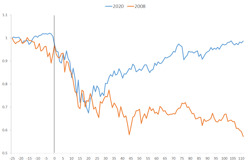
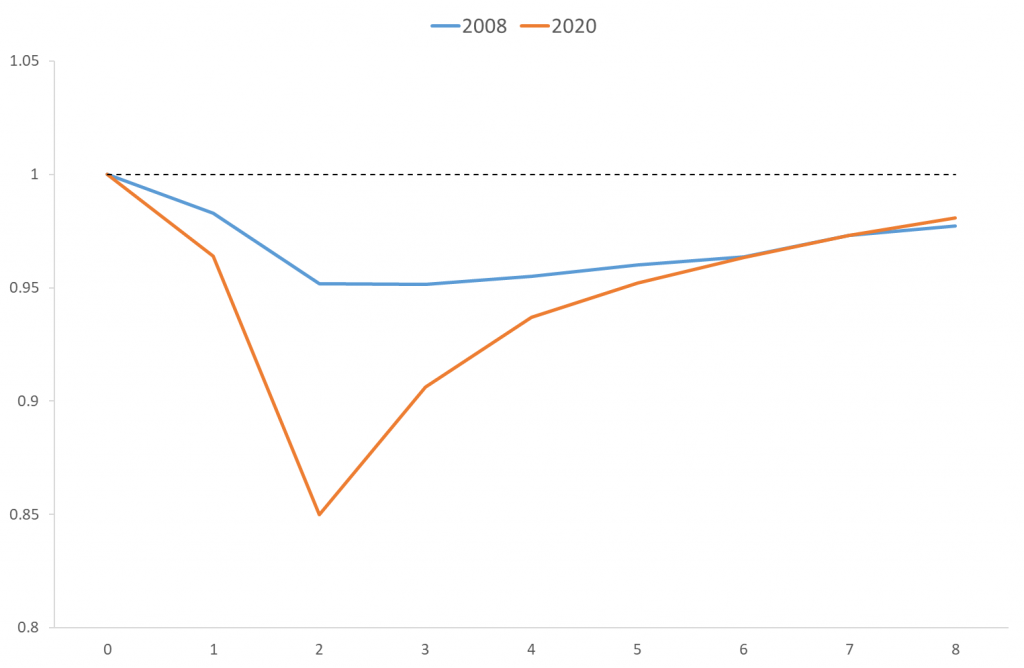
Markets also recovered after the 2008 financial crisis
This is a no-brainer: Markets always recover. The point here is that this rebound has just been amazingly strong. In this graph, I compare the behavior of the SP500 during autumn 2008 and the corona crisis. “0” in the figure is September 19, 2008, respectively February 21, 2020:
Data source: Fed St. Louis Database
During the first couple of weeks of this spring’s crash, it looked like autumn 2008. The pain was short-lived, though. Stock markets fell for a couple of weeks and then rebounded. In 2008, stocks just continued falling.
It has taken a couple of months to recover this time around. After the financial crisis of 2008, it took more than two years. This figure shows that the US stock market was back at its summer-2008 level in early 2011 only, and the world stock market later still.

Data source: Thomson Reuter Datastream via Eikon.
This recession is not as bad as 2008
It should be obvious by now that this argument is very wrong indeed. I have argued myself that there is hope that, when we get a vaccine and economic activity picks up again, the economic rebound will be stronger than in 2008, the reason being that we entered this recession with a more “balanced” economy than in 2008 (in 2008, we had a housing bubble, a weak financial sector, etc.). Nevertheless, the short-run loss this time around is just so much larger than in 2008.
Last week, we got figures for GDP in the US and Europe. This graph compares the cumulative falls in real GDP in the Eurozone and the US in Q3+Q4 2008 with the cumulative drops during the first two quarters of this year.

Data source: Fed St. Louis Database
US real GDP fell by more than three percent in Q3 and Q4 2008, whereas Eurozone real GDP dropped by five percent in autumn 2008. It was a severe recession in 2008. Nevertheless, it pales compared to this recession. This time around, US GDP has fallen by more than ten percent already and Eurozone GDP is down by a staggering 15% during the first two quarters of 2020.
What about the length of the recovery? After 2008, it took around two years before economic activity had reached its pre-crisis level. This figure shows for, e.g., the Eurozone that it will last more or less equally long this time (expectations for 2020 and 2021 are from the EU Commission, Spring 2020).
Data source: EU commission.
The figure shows that Eurozone GDP was 5% lower in Q4 2008 compared to Q2 2008 whereas it is 15% down in Q2 2020 compared with Q4 2019. After eight quarters, GDP is basically back at its pre-crisis level. This means that the recovery is expected to be stronger, but this recession is just very deep.
In other words, this recession is much deeper – one can multiply the drop in 2008 by a factor of three or so to get the drop this time – and it will take several years before economic activity is back at pre-crisis levels. This means that the short-run cost to society is bigger this time around (a deeper fall stretched over the same period).
And, in spite of this very strong recession, stocks are doing fine. That is perplexing.
Above, I have presented stories that cannot explain what has been going on. In my next post (link), I will offer my view on this.