
The hype around the “Magnificent 7” stocks that have driven the stock market this year is reminiscent of the dot.com era, which ended with a spectacular crash. However, there are two reasons why today’s developments seem less worrying: The rise of hyped stocks was more extreme in the dot.com era, as was the rise of the rest of the market. While today’s situation is exceptional, with seven stocks accounting for nearly 30% of the total value of the S&P 500, the rule in the past has been that only a few stocks generated most of the value creation of the stock market in the US and internationally. I conclude with a recent example that illustrates the danger of picking the wrong stocks.
In my last analysis (link), I documented how 7 stocks – the sometimes called “Magnificent 7” (Alphabet, Amazon, Apple, Meta, Microsoft, Nvidia and Tesla) – generated most of the gain of the entire stock market in 2023. Had it not been for these 7 stocks, the market value of the companies included in the S&P 500 would have increased by 4%. Including the 7 stocks, however, the market value of the index increased by 15%. This means that 7 stocks generated 70% of the value creation of all 500 companies in the S&P 500, the world’s leading stock market index, in 2023.
The fact that the entire market is so dependent on a few stocks is worrying because it means that if one, two or three of these stocks were to falter, the market would falter.
There is also another cause for concern: the similarity to the dot.com bubble at the turn of the millennium. Then, as now, a few stocks rose spectacularly. And then as now, it was mainly technology stocks. So a little analysis of the similarities and differences between the dot.com period and today seems warranted.
Few stocks today and few stocks during dot.com
Today we talk about the Magnificent 7. At the turn of the millennium, we talked in a similar way about the spectacular performance of a few selected stocks, mostly tech stocks. However, there was no known acronym. I have spoken to people who lived through the dot.com bubble. Like me, they cannot remember such an acronym. I also asked ChatGPT, which agreed:
“While there were certainly popular tech companies at the time, they weren’t grouped under a single catchy acronym like FAANG (Facebook, Amazon, Apple, Netflix, Google, now Alphabet) which represents some of the most prominent tech giants of the current era. The dot-com bubble era saw the rise and fall of various internet-related companies, but they were often referred to individually by their company names rather than being grouped together under a specific acronym.”
So I pick 5 stocks that (i) were talked about a lot at the time, (ii) were in the S&P 500 during the dot.com phase, and (iii) were all worth more than $100 billion in the beginning of 2000. These 5 stocks are Cisco, Dell, Intel, Lucent and Microsoft, referred to here as CDILM.
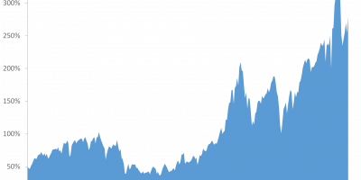
In Figure 1, I show the evolution of the total market value of these 5 stocks during the dot.com era, starting on 1 January 1997 (lower x-axis). I compare this with the evolution of the total value of Mag7 since 1 January 2019 (upper x-axis).

Source: Datastream via Refinitiv and J. Rangvid.
Figure 1 shows that while Mag7 had a spectacular run from 2019 to December 2021, rising more than 200% in just three years, the performance during the dot.com era was even more extreme. The aggregate value of the 5 stocks considered here (Cisco, Dell, Intel, Lucent and Microsoft) rose almost 600%(!) in just three years, from January 1997 to April 2000. That is three times more than the already spectacular rise of the Magnificent 7. It was crazy.
What is thought-provoking is the fact that the subsequent crash of these 5 stocks after the bubble burst was almost as spectacular as their rise before the burst. From their peak with a total market value of $1.85 trillion at the end of March 2000, they fell to $0.6 trillion in early April 2001, a loss of 2/3 (67%) in just one year!
The rest of the market
So the rally of a few selected stocks was more extreme during the dot.com period, but so was the performance of the remaining 490+ stocks.
Figure 2 shows how the total market value of non-CDILM stocks, i.e. the remaining 495 stocks (the stocks other than the 5 CDILM stocks), evolved during the dot.com bubble compared to the performance of non-Mag7 stocks, i.e. the remaining 493 stocks today.

Source: Datastream via Refinitiv and J. Rangvid.
Today, from the beginning of 2019 to their peak at the end of 2021, the value of the remaining 493 non-Mag7 stocks in the S&P 500 has increased by 65%, from $18 trillion to $29 trillion.
During the dot.com era, from early 1997 to its peak in September 2000, the value of the remaining 495 non-CDILM stocks increased by 120%, from $5.3 trillion to nearly $11.7 trillion.
The conclusion is that a few hyped stocks rose much more during dot.com than today, but so did the rest of the market.
(Note, by the way, that the hyped 5 CDILM dot.com stocks peaked in April 2000, while the rest of the market peaked a little later, in September 2000).
Moreover, in 1997 the 5 CDILM stocks accounted for 5% of the total value of the S&P 500. By April 2000, this share had tripled to 15%. Compare this to what I showed in my last analysis (link), which is that the Magnificent 7 now account for almost 30% of the total value of the S&P 500, up from 14% at the beginning of 1999.
All of this together – that is that the 5 CDILM stocks accounted for a smaller share of the total S&P 500 and that the rest of the market rose more during the dot.com period than it has done during recent years – means that the importance of these few stocks to the overall market’s gain is greater today than it was during the dot.com period. Figure 3a shows the cumulative increase in value of all companies in the S&P 500 during the dot.com era, i.e. since 1997, split between the increase in value of the selected 5 CDILM stocks and the remaining 495 stocks. This can be compared to Figure 3b, which shows the same thing, but here since 2019 and for the split between the Magnificent 7 and the remaining 493 stocks.
Figures 3a and 3b reveal that the Magnificent 7 have generated a larger share of the total market gain in recent years than the selected five stocks during the dot.com bubble (the orange area is larger today relative to the blue area).

Source: Datastream via Refinitiv and J. Rangvid.

Source: Datastream via Refinitiv and J. Rangvid
Another way of saying this is that the upswing during the dot.com era was broader. This is both good and bad for today’s outlook:
It is good because it indicates that the market as such is probably less overvalued today than during the dot.com bubble (see also Figure 4 below). When the entire market is overvalued (whatever overvaluation exactly means), the entire market crashes when the bubble implodes, as it did after 2000.
On the other hand, it is bad because the performance of the overall market is so sensitive to the performance of a few winners. If the few Mag7 winners disappoint, the market could disappoint.
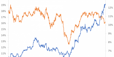
So the cautious conclusion I draw here is that the risk of a major stock market crash was probably higher at the turn of the millennium than today. In drawing this conclusion, I am of course aware that one cannot only look at the development of the market value. The value of a market or a share can rise sharply for perfectly rational reasons if the future looks rosy. So I also look at market valuations. Figure 4 shows CAPE by Nobel laureate Robert Shiller. CAPE is the cyclically adjusted price-to-earnings ratio, i.e. the current value of the S&P 500 divided by the average earnings per share over the last ten years. The figure shows that the market was valued higher during the dot.com bubble. It reached its all-time high in the summer of 2000. At its peak, it was 43. Today it is 31.

Source: R. Shiller’s webpage and J. Rangvid.
Incidentally, the decline of CAPE since the end of 2021 also means that the CAPE earnings yield, the invest of CAPE, which historically has been a good indicator of future long-term real stock returns (link), has risen from 2.6% at the end of 2021 to 3.3% today. In the summer of 2000, the earnings yield was 2.3%
I have in this analysis looked at a few selected stocks as a group, specifically CDILM and Mag7. If you want to learn more about how individual hyped companies fared during the dot.com bubble and after, Research Affiliates has a nice recent analysis (link). They show that only one of the top ten tech companies in 1999 has outperformed the S&P 500 in the aftermath, i.e. to date. They also conclude that Nvidia’s share price today is a bubble.
Further evidence of the importance of a few stocks
I have discussed how a few stocks have dominate the entire stock market. It turns out that the importance of a few stocks to the overall market is not limited to the dot.com era and today but has been a general tendency during the last century, even if the situation today is extreme with seven stocks accounting for almost 30% of the market. This emerges from the work of Arizona State University professor Hendrik Bessembinder (link).
In 2018, Hendrik published an article looking at how often individual stocks (included in the S&P 500) outperformed safe investments in US T-bills (link). He found that individual stocks underperformed holding one-month Treasury bills (over the same investment period) four out of seven times, i.e. it is more likely than not that an individual stock underperforms an investment in a safe T-bill.
This seems surprising at first glance, as we are used to hearing that stocks outperform bonds/bills. Hendrick has found that this is not true when looking at individual stocks. On the other hand, if you look at the whole stock market, it is. How can this be? The reason is that stock returns are skewed, i.e. the large positive returns of a few stocks offset the small and often negative returns delivered by the typical stock. To illustrate this point, Hendrick examined the total value created by all 25,300 companies that have issued shares since 1926 and are listed in the CRSP common stock database. He found that only 4% of all stocks have generated the total net value creation in the US stock market.
In a paper published this year, Hendrik and co-authors examine global stocks (link). They look at 64,000 stocks for the 1990-2020 period. They find that “the top-performing 2.4% of firms account for all of the $US 75.7 trillion in net global stock market wealth creation from 1990 to December 2020. Outside the United States, 1.41% of firms account for the $US 30.7 trillion in net wealth creation.”
As in my last analysis, Hendrick emphasises that these results suggest that the potential return on stock picking is very high if you can identify the winners a priori, which, however, is very difficult.
So is it good or bad that the market is so dominated by a few stocks? Probably not so good, because this paper (link) notes that “concentrated stock markets dominated by a small number of very successful firms are associated with less efficient capital allocation, sluggish initial public offering and innovation activity, and slower economic growth.” Also, this paper (link) by Xavier Gabaix finds that macroeconomic outcomes can be influenced by a few large companies, which by the way is currently being discussed in my small country (Denmark) where Novo Nordisk has become such a dominant company, both for the Danish stock market and for the Danish economy. For example, Danish GDP increased by 1.7% from mid-2022 to mid-2023, but would have decreased by 0.3% if it were not for the medical industry, i.e. Novo.
An example of the danger of concentrated bets
When only a few companies drive the stock market, there is a danger of missing out on the value creation of the stock market by betting on the wrong stocks. A current example illustrates this.
One of Europe’s largest pension funds, ATP, to which all working Danes must contribute, is an active stock picker. For example, their total holdings of Mag7, which, as mentioned, account for 28% of the S&P 500, are smaller than their holdings of many small Danish companies unknown to the world (link). Furthermore, 50% of the listed shares held by ATP are Danish, but the Danish stock market represents less than 1% of the global stock market (link). And among the heavily overweighted Danish stocks, ATP has deselected investments in aforementioned Novo, the standout 2023 winner among otherwise disappointing Danish stocks.
By deselecting Mag7, the global winners, overweighting Danish equities, global laggards, and deselecting Novo, the Danish winner, it is not surprising that ATP performed worse than other pension funds in 2023.
This active strategy can be compared to the passive strategy of the Norwegian Oil Fund, which aims to replicate the global portfolio. Mag7 accounts for 12% of the oil fund’s portfolio, and Mag7 has provided a third of its return in the first half of this year (link). If Mag7 crashes, ATP will look clever, but for now it does not.
There are smart active funds out there, think Berkshire Hathaway and the like. So it’s perfectly fine to voluntarily buy an active mutual fund in the hope that it will do well. What I fail to understand is why a mandatory large pension fund would concentrate its bets to such an extent.
Conclusion
It has been a good year for the S&P 500. So far, the value of the 500 companies in the index has increased by 15%. However, 70% of this increase has been generated by only 7 companies.
At the turn of the millennium, during the dot.com era, something similar happened. A few companies rose spectacularly. Like today, these companies were mainly technology companies.
There are similarities with the dot.com era, but there are also important differences. The rally at that time was more extreme. The rest of the market also rose dramatically and valuations were high. The bubble was clear and the subsequent crash was spectacular. While the market today is more dependent on a few stocks than during dot.com, the broad market, on the other hand, seems to be less “overvalued”. This could indicate that the situation for the whole market is not as extreme as during the dot.com bubble.